


Mastering the Watermark: Best Practices for Your Photos
In today’s digital age, protecting your photographs online is crucial, especially if you are a photographer who wants to showcase your work or share it on various platforms. One effective way to protect your images is by adding a watermark—a semi-transparent mark or logo that identifies you as the creator. In this blog post, we will explore the best practices for adding a watermark to your photographs.
Typeface Selection: Opt for a simple font like Arial, Helvetica, or Tahoma when creating your watermark. Avoid using script or handwritten fonts as they can be difficult to read and may distract from your image.
Separate from Your Logo: Remember that a watermark should not be a substitute for your logo. It’s best to keep your watermark separate from your logo to avoid confusion.
Copyright Symbol: To indicate your copyright ownership, add the copyright symbol (©) in front of your watermark. You can easily insert the copyright symbol by pressing ALT+169 on your keyboard.
Include the Year: Adding the year to your watermark provides valuable information about the creation or publication date of your photograph. For example, you can incorporate the year after your watermark like this: © Watermark 2023.
Typeface Color: Set your watermark type to white for optimal visibility and legibility, especially on darker or more complex backgrounds.
Opacity Adjustment: Lowering the opacity of your watermark to around 50% ensures that it doesn’t overpower your image while still being noticeable enough to discourage unauthorized use.
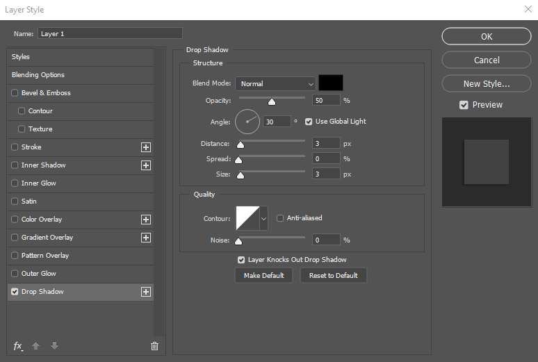
Subtle Drop Shadow: Enhance the visibility of your watermark by adding a subtle black drop shadow with an opacity of 50%. This effect can help your watermark stand out without being overly intrusive.

A quick run down of the settings I recommend for your watermark:
- Typeface: Arial, Helvetica, or Tahoma
- Copyright Symbol: ©
- Watermark Text: Your desired watermark text (e.g., “Your Name”)
- Year: Incorporate the current year (e.g., 2023)
- Typeface Color: White
- Opacity: 50%
- Drop Shadow: Subtle black with an opacity of 50% – See my drop shadow settings using Adobe Photoshop below
Adding a watermark to your photographs is an effective way to protect your work and establish your brand as a photographer. By following the best practices discussed in this blog post—keeping it simple, strategic placement, adjusting opacity, choosing the right font and size, using dedicated software, including copyright information, and striking a balance—you can enhance the security of your images while maintaining their visual integrity. Safeguard your creative efforts and share your work with confidence in the digital realm.